


When you check the weather, you probably look for temperature and rain. But what about air quality?
Whether you’re commuting to work, exercising outdoors, or simply opening a window, air quality directly impacts your health—and yet, most people don’t fully understand what those index numbers and coloured charts really mean. This guide breaks down the world’s most common air quality indices, the pollutants they measure, and how to interpret them so you can make smarter decisions about the air you breathe.
What Is the AQI?
The Air Quality Index (AQI) is a scale used by governments around the world to report daily air pollution levels. It combines readings from multiple pollutants—like PM2.5, PM10, Ozone (O₃), Carbon Monoxide (CO), Sulfur Dioxide (SO₂), and Nitrogen Dioxide (NO₂)—into a single, easy-to-read number.
Each country may have its own variation, but most AQI systems use a 0–500 scale:
| AQI Range | Description | Colour Code | Health Advisory |
|---|---|---|---|
| 0–50 | Good | Green | Air quality is ideal |
| 51–100 | Moderate | Yellow | Acceptable for most; sensitive groups may react |
| 101–150 | Unhealthy for Sensitive Groups | Orange | Children, elderly, MCS sufferers should limit outdoor time |
| 151–200 | Unhealthy | Red | General public may begin to experience symptoms |
| 201–300 | Very Unhealthy | Purple | Serious health risks for everyone |
| 301+ | Hazardous | Maroon | Emergency conditions – avoid all outdoor exposure |
🡪 Source: US EPA AQI guidelines [1]
What’s the Difference Between AQI and PM Levels?
While AQI gives a combined risk score, you’ll often see PM2.5 and PM10 reported directly—especially on air quality monitors and apps.
- PM2.5: Particles smaller than 2.5 microns—dangerous because they penetrate deep into the lungs
- PM10: Larger particles like dust and pollen
- PM1.0: Ultrafine particles—often found in combustion fumes and smoke (less commonly reported)
The World Health Organization (WHO) recommends the following daily exposure limits:
| Pollutant | WHO 24-Hour Guideline |
|---|---|
| PM2.5 | 15 µg/m³ |
| PM10 | 45 µg/m³ |
| NO₂ | 25 µg/m³ |
| O₃ (8-hour) | 100 µg/m³ |
🡪 Source: WHO Global Air Quality Guidelines 2021 [2]
Most cities around the world exceed these limits regularly—especially in areas affected by traffic, industry, or seasonal wildfires.
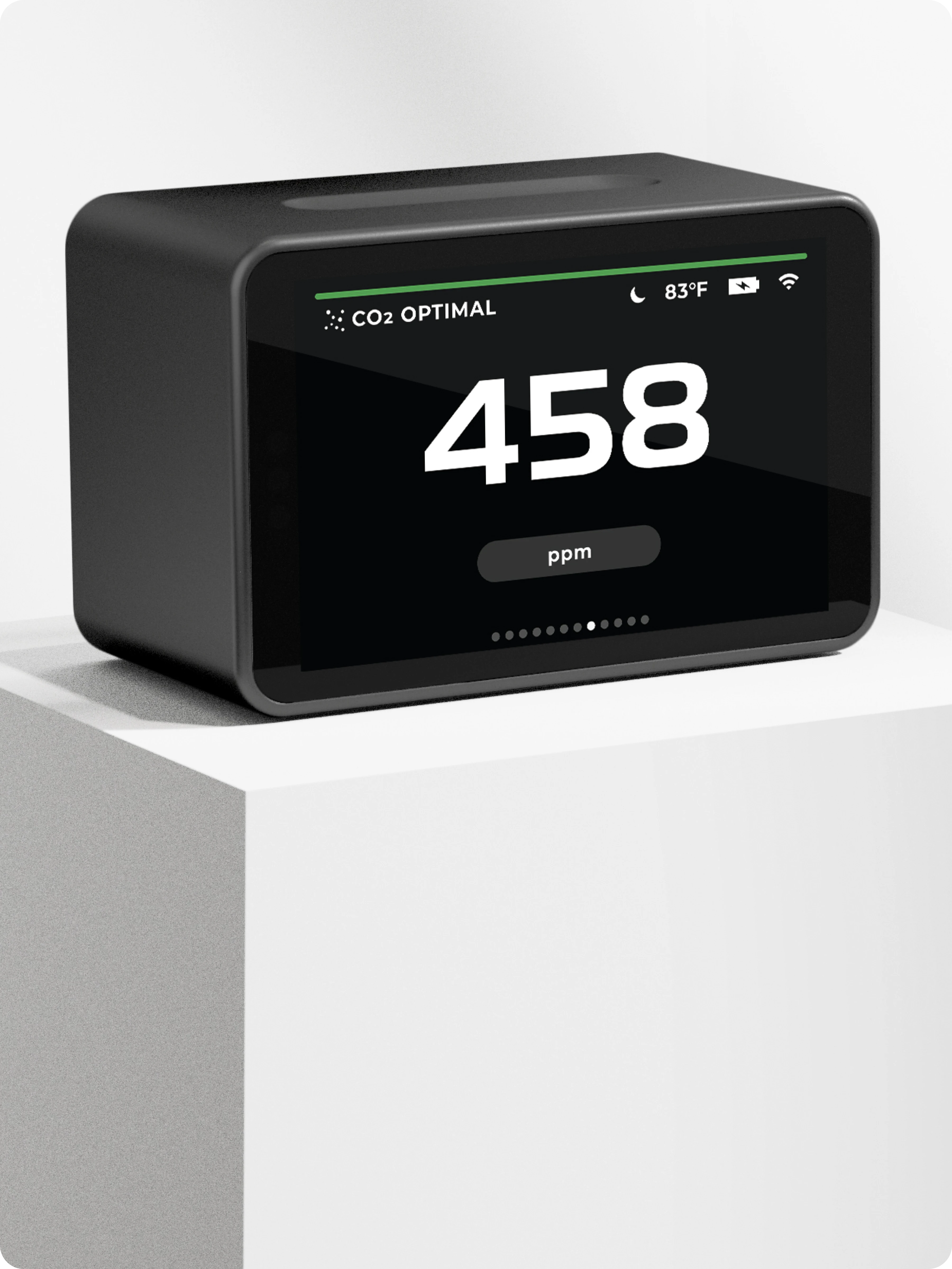
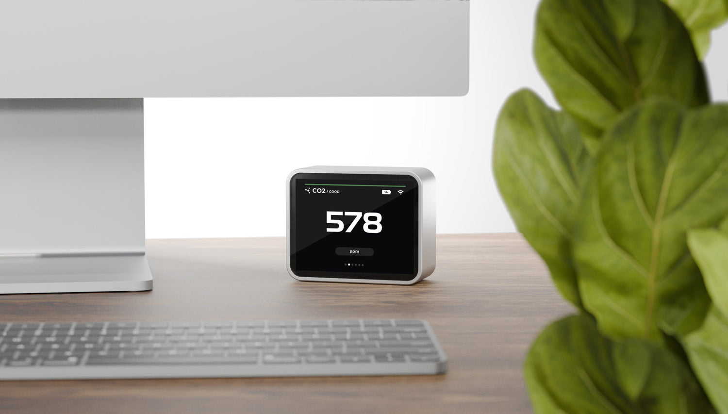
How to Read Your Air Quality Monitor or App
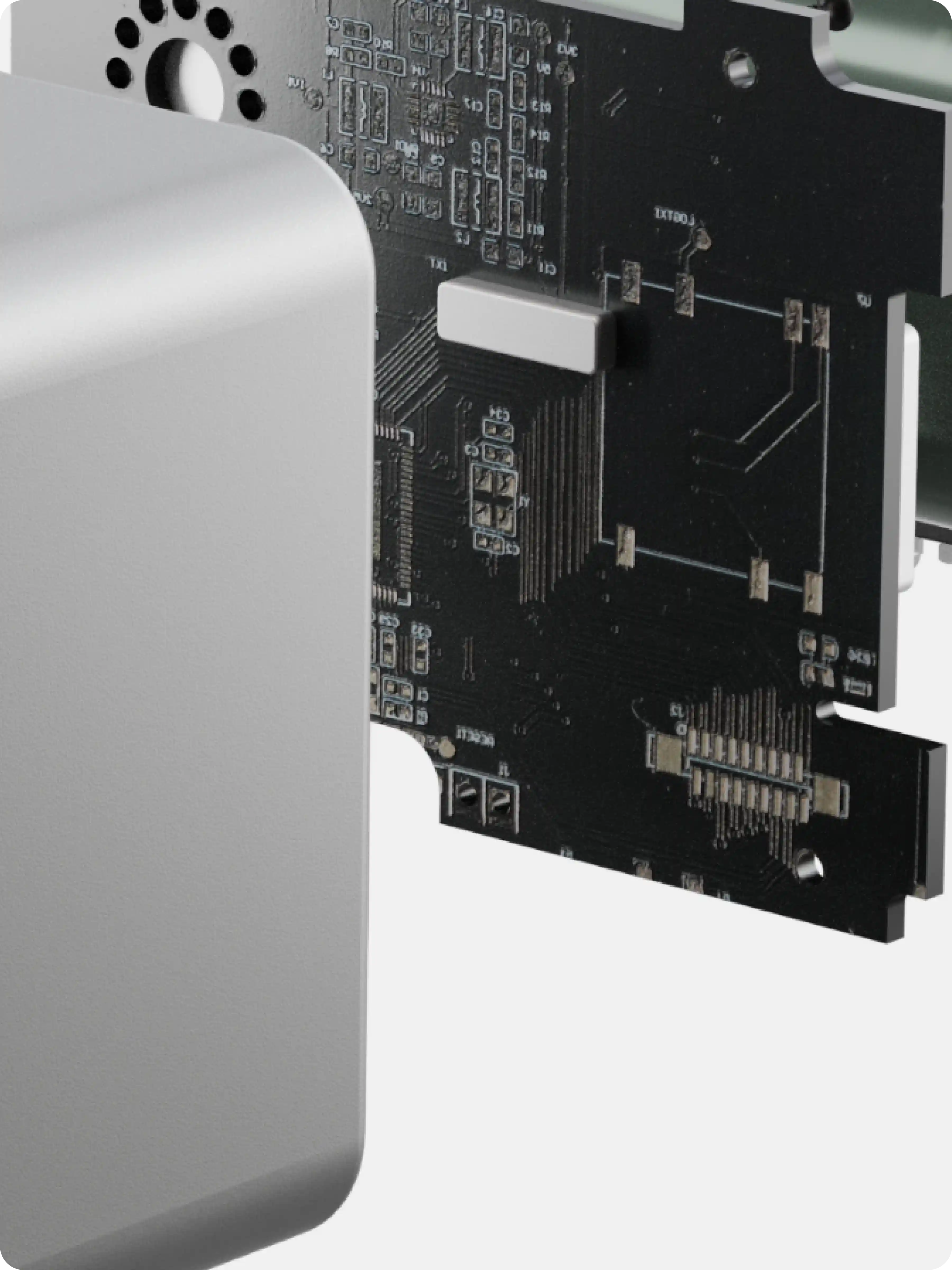
When using a personal air quality monitor (like AusAir’s upcoming multi-sensor device), you’ll see real-time readings of pollutants like PM1.0, PM2.5, CO₂, and TVOCs. These are not AQI scores—but they give you raw data that can be even more powerful.
Here’s how to interpret them:
- PM2.5 > 35 µg/m³ = Consider wearing a mask or using an air purifier
- TVOC > 500 ppb = Open windows, ventilate space
- CO₂ > 1000 ppm = Ventilation is insufficient (expect fatigue, low focus)
- HCHO > 0.1 mg/m³ = Formaldehyde levels are high—consider source control or activated carbon filtration
Final Thoughts: Why It Matters
Clean air is not guaranteed, even in modern cities. With urbanisation, wildfires, and global traffic congestion, exposure to air pollution is now one of the top global health threats—linked to over 7 million premature deaths each year [3].
Understanding how to read air quality indices empowers you to take action:
- Adjust your routine
- Wear a high-filtration mask
- Improve indoor ventilation
- Use a reliable monitor to stay informed
Understanding air quality isn’t just for scientists or policymakers—it’s for anyone who breathes. Whether you're managing a health condition, looking out for your family, or simply trying to make more informed choices each day, staying aware of air quality indices can help you take meaningful steps toward a healthier life.

Leave a comment
All comments are moderated before being published.
This site is protected by hCaptcha and the hCaptcha Privacy Policy and Terms of Service apply.